April 17, 2024
What is a CTA & How to Use It
If you’re selling goods or services online you’ve probably heard about the CTA – the all magical engagement tool that will transform your business. But, do you know what it is?
Did you know that CTAs look different depending on if you’re on a website, a social platform, or a google ad?
Did you know there are multiple type of CTAs that help customers engage with your business at different times of the buying process?
Do you know the difference between a good CTA and a bad one?
If you don’t have all the answers, don’t panic! This article will teach you how to use effective CTAs in your marketing strategy. Download the Call to Action Checklist: 6 Steps to Nail Your CTA and follow along.
What is a CTA?
CTA is an acronym for “Call to Action”. A Call to Action is your way of showing customers exactly how they can buy your product or service.
When customers visit your website, they’re already interested in your product or service. They’re excited to learn more about the details and may even be ready to buy. That’s where the Call to Action comes in.
Because we’re already familiar with our own processes, we often assume our customers know what to do too. But the truth is – customers need clear instructions that are easy to find that show them the way to make a successful purchase.
What does a CTA look like?
Calls to Action come in varying formats depending on your platform. The most common and effective CTA for websites is a bold button in the header, above the fold, and repeated across your site.

If you’re on Instagram stories, you’ll see CTAs in action in the “swipe up” action that encourages users to engage while watching.
If you are running Facebook ads the “Shop Now” button sits on the right of your ad text.


Two Powerful Types of Tools
Your Call to Action is a powerful opportunity for customers to engage with your business. Not only does it offer them the chance to buy right now, but it can also give you an opportunity to nurture visitors who are interested but not ready to take the plunge.
Direct Calls to Action are Obvious and Urgent
Most CTAs are Direct. These clear directives are intended to help customers buy right now. Direct Calls to Action are the most familiar and easy to implement in any platform – digital or analog.
Some examples of direct calls to action are:
- Buy now
- Add to card
- Schedule a consultation
- Register today
- Order today
In addition to using direct calls to action on your website, you can use them in email-blasts, commercials, google ads, and social media ad campaigns. In fact, you should include a direct CTA in every piece of media you create so customers are clear on what to do next.
Transitional Calls to Action Build Trust
While Direct CTAs are obvious, Transitional Calls to Action are more subtle but equally powerful drivers for your business. Transitional CTAs are great tools to help establish your business as a leader in your industry or niche. They provide guidance and build trust helping you convert leads into clients.
Some examples of transitional calls to action are:
- Free Information:
Providing white papers, guides, and educational videos about your industry set you up as the trusted guide for your customers and helps build trust. - Free Trials & Samples:
Offer a limited-time trial or free sample of your product provides a risk-free opportunity to test-drive a product before buying. Sharing the first few pages of your book or a free segment of your course can quickly on-ramp customers. - Testimonials:
When you share testimonials from your customers you help potential customers see how your business can make their life easier.

Use transitional calls to action to create a relationship with your potential customer so they are ready to use the direct CTA when the time to purchase is right.
Where does it go on your website?
Effective website CTAs are most commonly found in 2 main places:
- On the Header at the end of the menu
- Above the fold, on the hero or first section of your landing page
Many businesses will place their “Contact Us” or “Schedule a Demo” CTA on the header of their website. But why should your CTA go in the header?
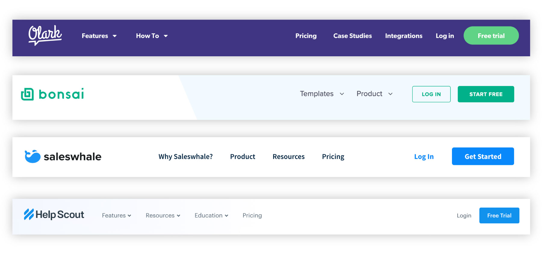
The header is generally uniform across all pages of a website so customers will see the same clear call to action no matter where they are on the website. As an added bonus, updates to your header are also uniform so you can add the CTA in one place and it will populate consistently across your whole website.
Not only is this easier on you, but it builds a repeated, familiar component that your customers can trust.
If you’ve already added a CTA to your header, you can reemphasize it above the fold – in the first section of your landing page. Combine a clear header that addresses your customer’s need with your CTA at the top of your page to encourage your customers to take action.
What is the difference between a good CTA and a bad one?
Sometimes Calls to Action don’t work. If your CTA isn’t directing the user to a single action, isn’t prominent enough, or confuses the customer it will fail. Be intentional and your customer will be clear in their next step.
What are the characteristics of bad CTAs?
- Vague or confusing messaging
- Hard to find
- Difficult to use
- cannot be measured

What are the characteristics of good CTAs?
- Direct the customer to a single specific action
- Easy to find
- Simple to use
- Really great calls to action are measurable
A good CTA is clear on what to do next
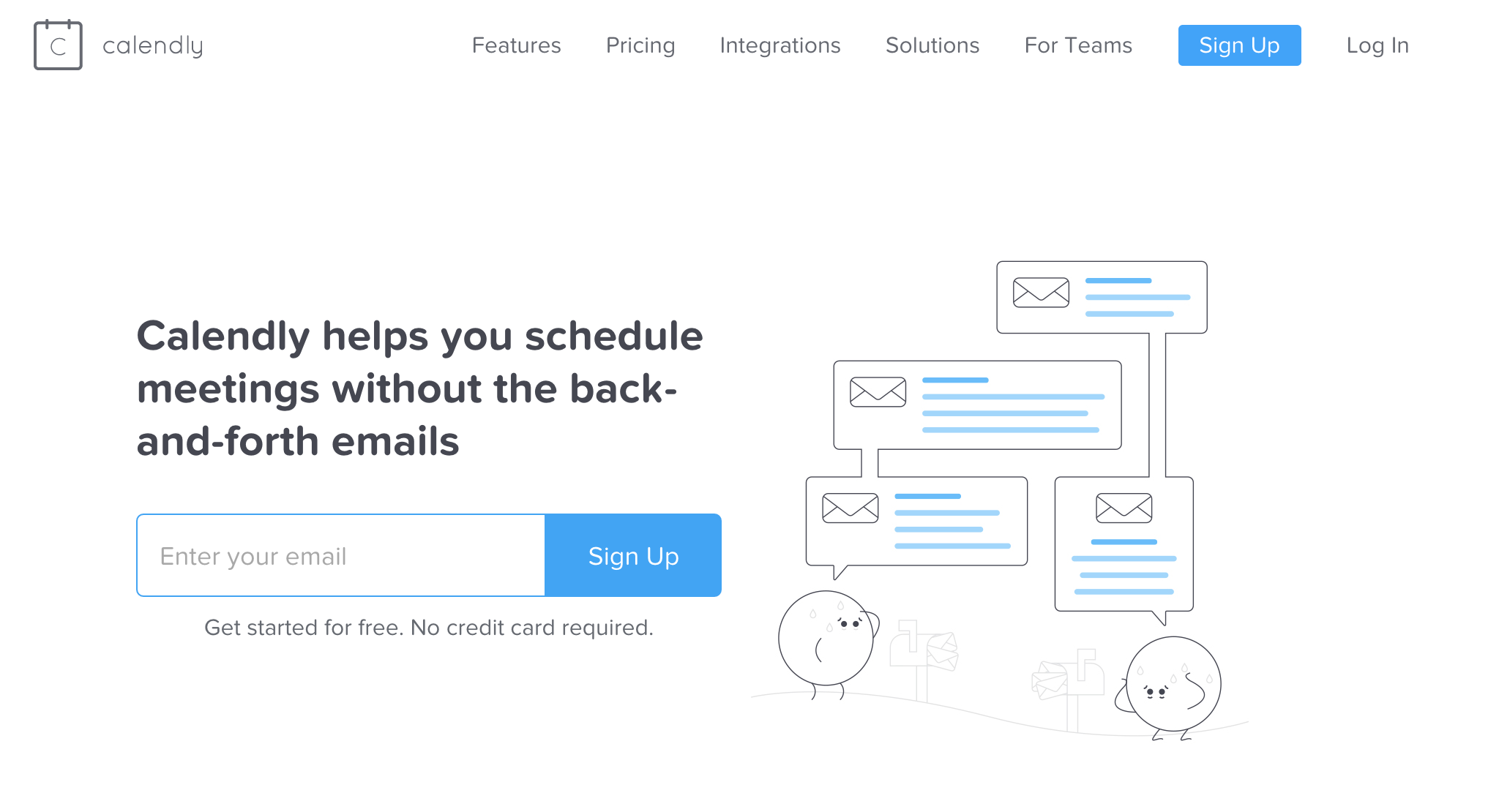
Calendly‘s homepage boasts a great example of effective CTAs.
They want users to sign up for their product, so they offer a clear CTA in the header (making it repeatable on every page). They repeat it again in the hero section of the homepage including an easy one-field form and encouragement that the signup process is free with no card required.
How do you know if your CTA is effective?
The best way to know if your call to action is working is to measure it.
When working on a website I use Google Analytics events and goals to track how well my CTA is performing.
Most social platforms and CRMs will automatically track performance of your call to action. If you don’t see analytics information check that you’re using a business account and that you’ve setup your CTA correctly.
Connecting the Dots
Calls to action are powerful engagement tools that encourage your customers to take action. They come in varying styles based on your platform – the best ones are clear and concise – no matter where you use them. You can use Direct or Transitional CTAs to engage with your customers and you can make sure they are effective by following a few simple guidelines.
Download the free Step-by-step Call to Action checklist to help you create powerful CTAs for your website and start engaging with your customers today!
